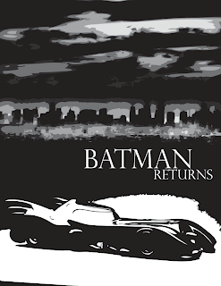
Ok, so this is my 2nd composition. Again I kept the same typeface only this time I changed the size of Batman vs. the size of Returns. I didn't know if this really has an impact, but I was also thinking of doing the reverse. Should returns have more hierarchy because he is "returning" and that is the most important part of the movie.
This image is something that I really like. My biggest goal in this project is to make it black and white with some bright colors, kind of like the actually comic books. Those are my strongest influences and I really wanted that to come to mind when you watch the title sequence.
I really like the shadows on the Batmobile and to me they are extremely effective. I used more gray tones in the background city to show a little more detail in the sky and landscape. Is this style effective? Is there anything I could do to make this better? I would love feedback. Thanks!
2 comments:
This is an interesting concept. But I automatically think comic book is that what you are going for? I agree with the batmoblie its a great graphic image.
if comic book is he style you want to refer to - these are effective. The drawing style up front works well - clean (comicbook-like) wile the style in the back reads way to much like an illustrator live trace. perhaps draw your background elements yourself and incorporate them into the sequence. or - steal from existing comic books and translate directly - you can keep them as bitmaps - you don't have to turn them into vectors. It feels like it need a little more polish still. The tone isn't completely clear.
Post a Comment