Monday, October 27, 2008


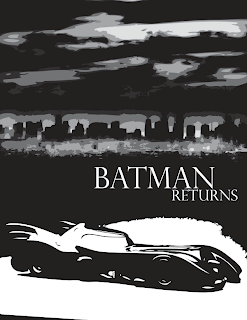
Ok, so this is my 2nd composition. Again I kept the same typeface only this time I changed the size of Batman vs. the size of Returns. I didn't know if this really has an impact, but I was also thinking of doing the reverse. Should returns have more hierarchy because he is "returning" and that is the most important part of the movie.
This image is something that I really like. My biggest goal in this project is to make it black and white with some bright colors, kind of like the actually comic books. Those are my strongest influences and I really wanted that to come to mind when you watch the title sequence.
I really like the shadows on the Batmobile and to me they are extremely effective. I used more gray tones in the background city to show a little more detail in the sky and landscape. Is this style effective? Is there anything I could do to make this better? I would love feedback. Thanks!

Ok so this is my first composition for Batman Returns. I really like the idea of starting off the title sequence with the viewer zooming through a cave like tunnel. (One of my goals in my creative brief was to incorporate the watchers with the sequence) In the actually title sequence, it starts off with the birth of the penguin, which is extremely boring. I want the music to start and have the viewers zooming and twisting towards the names and title.
Visually, this composition is ok, it needs a little more. The bats should be black with white highlights from the light, but I should also incorporate the shadows to prove just how round the tunnel actually is. How does the typeface look? This is the one that I finally picked (with help from Jen), and I really like the weight in the letters.

Monday, October 20, 2008

Ms Catwoman

Notes on Catwoman

1. There is the scene where she actually ‘becomes’ catwoman, but this scene really isn’t an importance to the title sequence. I think that is more of what needs to be discovered during the movie.
2. Another scene, which does have some importance, is when she breaks into the department store and she actually has some practice time with her whip. Her whip is something that I want to incorporate during the title sequence because it has a lot of quick movements that will help move the text along. Specifically she jump ropes with her whip, she breaks heads off of manikins, she twirls it by her side, and then she wraps it around her waist and her neck (this kind of has a sexual effect I think).
3. Another scene is when her and batman fight and she falls into a truck full of kitty litter. “Saved by kitty litter……hahaha…..uhgh….bastard”
4. Another scene is actually when she was laying on the penguin’s bed. They were planning against batman. This really isn’t all that important, I just like that the villains are working together.

what do you think?

This title sequence is a little be closer in content to Batman, then catch me if you can. This is more of what I am interested in accomplishing.

Ok, Here Goes

Trying to explain exactly what I see in my head is kind of difficult. I am not a master at animation so I have no idea how to put what is in my head onto the computer. The YouTube video from Batman Returns, starts out with the birth of the penguin and then moves into the title sequence. I don't want my title sequence to be boring in the beginning, I want it to be BAM! in your face and get viewers really excited. anticipating the start of the movie. I really really really like the Catch Me If You Can title sequence and I am really influenced by that. Only that really isn't BAM! in your face Batman kind of thing....soooooooooooo....... I want to kind a keep the baby in the cradle flowing down, but keep in animated rather then real video footage. I also want to incorporate The penguin and his Duck, Catwoman and her whip, and side characters that help define the movie. I listed characters in my last two posts that have some importance obviously if their name is on the title sequence, and I want to show visual imagery with the text of their name. Does that make sense? I told you it was hard to explain.

Title???


How does this look? This is the typeface that I couldn't download before.

In case you were wondering...

BATMAN RETURNS Cast overview, first billed only:
Michael Keaton .... Batman/Bruce Wayne
Danny DeVito .... Penguin/Oswald Cobblepot
Michelle Pfeiffer .... Catwoman/Selina Kyle
Christopher Walken .... Max Shreck
Michael Gough .... Alfred Pennyworth
Michael Murphy .... The Mayor
Cristi Conaway .... Ice Princess
Andrew Bryniarski .... Charles 'Chip' Shreck
Pat Hingle .... Commissioner James Gordon
Vincent Schiavelli .... Organ Grinder

Exactly What Appears on my Title Sequence

1 Warner Bros. Presents
2 A Tim Burton Film
3 Michael Keaton
4 Danny DeVito
5 Michelle Pfeiffer
6 Christopher Walken
7 BATMAN…RETURNS (Rolls out) (Bats Fly through)
8 Based upon characters appearing in magazines published by DC COMICS INC.
9 Michael Gough
10 Pat Hingle
11 Michael Murphy
12 Vincent Schiavelli
13 Andrew Bryniarski, Cristi Conaway
14 Casting, Marion Dougherty
15 Special penguin makeup & effects produced by Stan Winston
16 Costume designers Bob Ringwood & Mary Vogt
17 Music By Danny Elfman
18 Film Editor Chris Lebenzon
19 Production designer Bo Welch
20 Director of photography Stefan Czapsky
21 Co-Producer Larry Franco
22 Executive producers Jon Peters and Peter Guber
23 Executive producers Benjamin Melniker and Michael E. Uslan
24 Based on Batman characters created by Bob Kane
25 Screenplay by Daniel Waters, Story by Daniel Waters & Sam Hamm
26 Produced by Denise Di Novi & Tim Burton
27 Directed by: Tim Burton

Title Sequence to Batman Returns

The Fonts I Like

My favorite is Orator Std because I like how everything is Caps and to me strikes the eye.

Forgot one

Perpetura Tilting MT
is my 10th Font choice, if you don't know what it looks like, open illustrator. sorry my blog hates me.

Visual exploration......


Ok which of these says "Batman" to you?......

Thursday, October 16, 2008

Creative Brief

Project Details
Date: 10/15/2008
Prepared by: Amber Schneider
Project Name: Batman Returns Title Sequence
Design Lead:
Hand-off to Production: 10/13/2008
Product Release: 11/12/2008

Project Concept:
The value of this project is not primarily a business one, it is more for an entertainment purpose. Having this title sequence will better the viewing experience of movie watchers everywhere.

Objectives:
*To show characters, not just shapes
*keep the viewer on the edge of their seat (music will help)
*Make the title sequence visually appealing
*to set the tone for the way the movie starts off

Audience:
The primary audience for this project would be young adults and adults. These individuals are interested in action movies with suspense. The secondary audience would be kids younger or adults over the age of 50. These viewers are watching this product because of love of the character or because they are judging the movie to that of old and better movies.

Perception/Tone:
I want the overall visual quality/tone of this project to be suspenseful and thrilling. I want viewers to think that they are actually involved in the movie. This would appeal to my target audience because this is what they want to see.

Communication:
In order to create the perception/tone and fulfill my overall project objectives I plan on following my schedule and finish everything on time. I will take critiques very seriously and accept help by my classmates and teachers.

Competitive Landscape:
Some competitive products might be movies like: Superman, Ironman, Spiderman etc. In order to work competitively against them I am planning on watching all of there title sequences to create something lively.

Single-Minded Message:
nananananananananana BATMAN!!

Monday, October 13, 2008

dumb

My typed-based animation is really lagging. Sorry.

Uploading animations

Sorry guys I have been having a hard time uploading my other two animations. They will be up asap, whenever this stupid thing will work.

Type-Based Animation

More images


Type-based Animation Images


Type-Based Animation

While working on our type-based animations we were to choose one more content and one more media limitations. I chose "Using an appropriated design language" as my media limitation choice. This was the limation that I used of taking only pictures of street signs. I then picked " Man-made objects" as my content limitations, and again this limitation was for the street signs. I tried to keep my signs very diverse in hopes that nothing was getting really repeated or boring.

My Last Animation!!

For the third and final animation, I worked on the Type-based animation piece. This one seemed to be the most difficult one for me and I am not sure why. I think it might have been because I am not completely comfortable using type in flash. My sound was that of a sirens driving in a city, I believe. For this piece I took pictures of different street signs all over the city of Corvallis. To me I was visualizing a car crash and what a driver would see if they had lost control of the car. This animation was interesting to make and it was fun working with images on flash, but overall wasn't my most successful.

Referential Animation

For the Referential animation, we were to choose one more content and one more media limitation for our piece. For the media limitation I chose the broom as the "1 found object to base the whole visual language off of". The broom was creating the sound and that was referential to the makers writing. The content limitation I used was "A person you know". In this case I used my roommate, Jackie, to do the action and she put on a show. :)

My Second Animation!!!

The second animation that I decided to work on next was the Referential Animation. For this piece I decided to use my sound of Writing Markers. This sound was very scratchy and kind of reminded me of nails on a chalkboard, just not as squeaky. I thought of maybe sandpaper, scratching bricks, and other crazy ideas when I thought of maybe a broom. I had one of my roommates sweep our front porch, becasue it was brick, and use different strokes in her sweeping to describe the different stroke lenghts in the writing. It worked out just as I wanted it to. I had some shots of her from far away and then eventually getting closer when the film was ending. This animation was pretty successful. If I could have done something better it would have been to align the brushing sounds of the broom with the sound bit a little better. They a just a little off and that kinda bugs me, I hope it doesn't for anyone else.

Abstract Animation Facts

In my Abstract Animation, we were supposed to choose one more media limitation from our list. My choice was "Found objects only" which happened to be a real fast spinning film of found objects in my house.

My First Animation!

The very first animation that I decided to work on was the Abstract Animation. The sound piece I used to work with was the Amusement Park. When thinking of an amusement park it instantly reminded me of being sick or nauseated. My idea was to film a room that had a wide variety of colors and lights and spin while I was recording. Well, it turned out just as I had wanted it to because when the sound piece and the film were placed together, I instantly vizualied myself on a park ride being spun to death. This animation probably took me the longest to get started, but that was becasue I was getting a feel for the program a little more. Overall I find this animation to be the most dramatic and possibly the most successful.

Siren Mind Map


Changing up the Sounds

After talking with Nicole and Elise on the 6th I decided to swith my third sound to a siren instead of just water running out of a faucet. The siren has a lot more diversity then the facet and was a lot easier to come up with an idea for.